
An exhibition at the user's pace
Black Wall Street Journey · shipped 2021–2026
- Role
- Platform Architect / Sole Engineer
- Timeframe
- V1 installation in 2021; subsequent V2 adaptation for the public website.
- Technologies
- React
- Next.js
- Strapi
- Skills
- Frontend architecture
- Interaction state modeling
- Content modeling
I adapted the timed exhibition into themes users could browse and open for reading, so its stories and research remained accessible after the physical run ended. Where original sources were available, I linked the material back to them.
About the project
Black Wall Street Journey is Rick Lowe's public-history initiative on Black wealth-building in Chicago. I was the sole software engineer, from the first system in 2021 through the public site that followed. Two versions: a timed installation across three Chicago venues, and a public website built from the same research.
- Timeframe
- Software involvement: 2021–2026; primary commissioned engineering: 2021–2022
Overview
Keeping the exhibition available after it closed
When the physical exhibition ended, we wanted people to still be able to experience Black Wall Street Journey. The project had an informational website explaining the exhibition, Toward Common Cause, Rick Lowe, and the contributors. We wanted to make the exhibition's stories and research available there too.
I had to adapt an experience that advanced on its own schedule into one people could explore themselves.
Solution
From playback to navigation
In the installation, visitors could choose when to arrive and how long to stay. They could leave and return while the exhibition was open. They couldn't choose when a slide advanced or go back to something they had missed.
The frontend followed a sequence of chapters and slides, using durations stored in the CMS to advance the presentation. On the website, users needed to choose what interested them and spend as much time with it as they wanted.
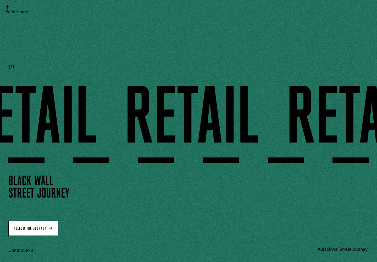
I replaced timed chapter progression with previous and next controls. Users could browse the themes, pass over one, open another, and return later. The themes appeared in a defined order, but users didn't have to read them in that order. The frontend still tracked the current chapter; a user's action determined when it changed.
Separating browsing from reading
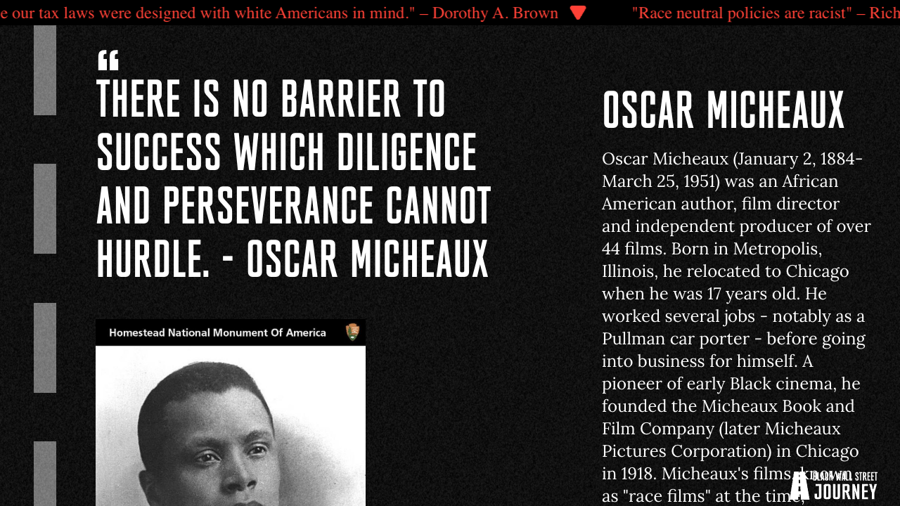
The online adaptation became a destination called “Ticker.” The name came from the stock-market-style marquee that displayed facts about Black wealth across the top of the installation. This destination held the broader exhibition material.
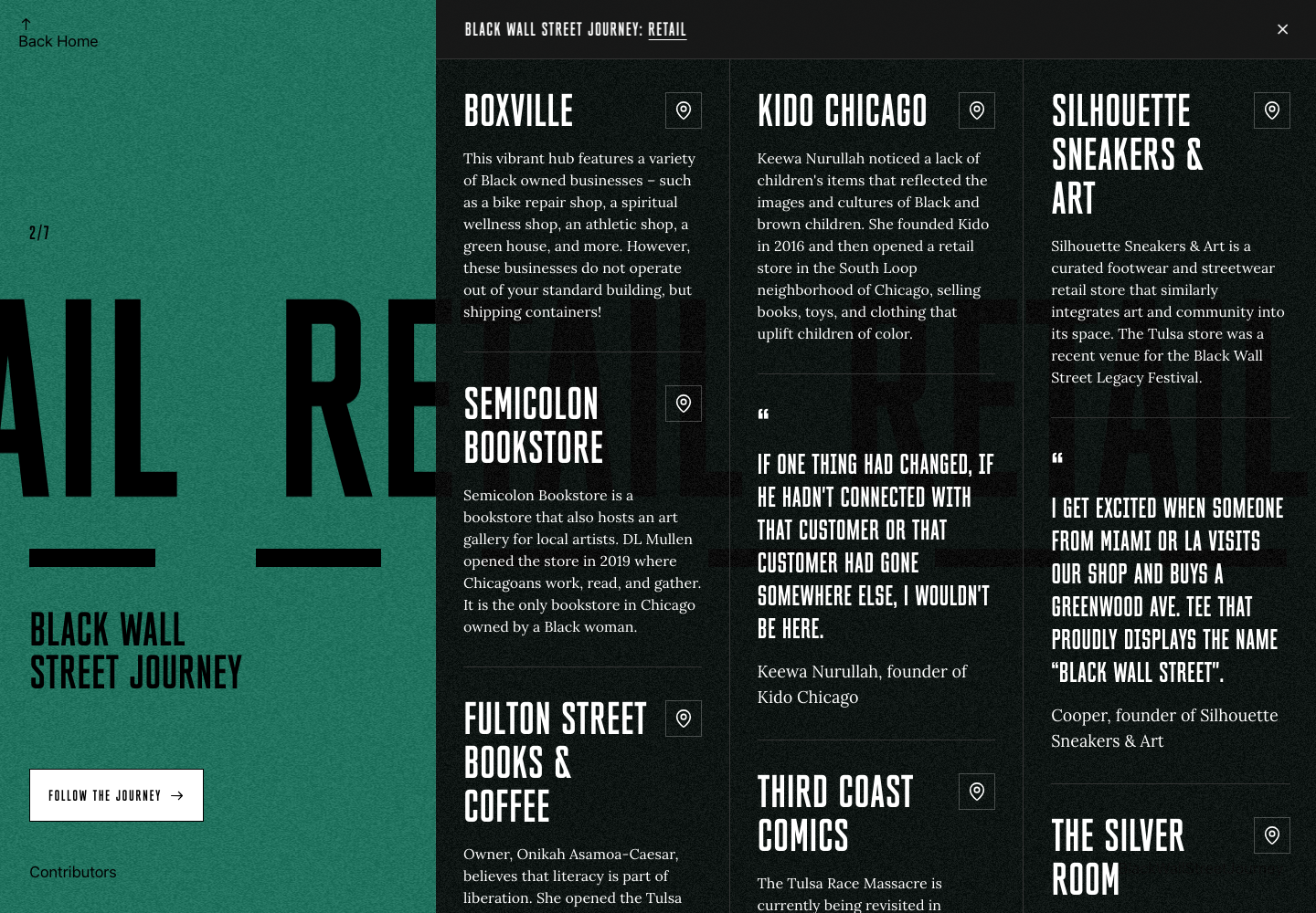
Selecting a theme opened a slide-out panel containing its stories and research. I kept the selected chapter and the panel's open state separate: the chapter ID determined which content to retrieve, while opening and closing the panel controlled whether the user was reading or browsing. Closing the panel returned them to the theme they had selected.
The moving theme titles retained the marquee reference. The research inside the panel stayed available at the user's pace.
Rendering the theme together
I read through the original information in the V1 CMS and grouped related material into themes. Multiple installation chapters covered the same subjects. Bringing those stories together gave users a way to explore retail, Black women in entrepreneurship, media, housing and real estate, and the other themes independently.
That organization informed what I needed to render. Once the selected theme's content loaded, the frontend rendered its blocks together. I used separate components for longer passages, quotations, headlines, and statistics within the reading panel.
Users could scroll, stop, reread, and compare material within the theme without waiting for a slide or having one advance before they were finished.
From timed playback to user-controlled reading
Making the research accessible
The source links were the best part of bringing the exhibition online.
Where the original sources were available, I linked the stories and data points back to them. Headline and statistic components rendered links associated with their content, while longer passages supported links within the text.
Users could open a PDF, examine demographic data, or read the research behind a particular story. The academic work remained connected to the information presented in the exhibition. They could experience the exhibition and then go into the research that made it possible.
Reflection
Preserving the visual identity
The research and much of the writing carried over from the installation. The art direction also had to survive the translation so the website remained recognizably Black Wall Street Journey.
Imagery played a smaller role. The adaptation became more informational, with more emphasis on reading and understanding the stories. I was comfortable with that compromise because it supported what people could now do with the material.
The website gave people access after the physical exhibition had closed. They could choose their own route through its themes, take their time with the stories, and follow the research further than the installation itself allowed.